Tuesday, June 2, 2009
Stone, flagstone, brick?
I taught a lesson today that was successful and I wanted to post it here on the blog so others could work with this idea.
I love to build up layers of color, whether it is with my watercolor or colored pencils. This lesson could be modified so many ways.
I was showing the student that he had the choice of what kind of textured wall he put in his drawing. We "practiced" three kinds of walls. These were small areas about the size of a business card (quick, 5 minute drills). We selected his favorite look and completed a small drawing.
Practice #1 was rounded field stones. Apply the color of the stones (mostly gray with a bit of light brown), fill in the negative dark areas and shade the lower edge of each stone with rounded or curved pencil marks.
Practice #2 was flat lime stone or flag stone. Apply the color of the flag stone (mostly light brown with a bit of gray), fill in the negative dark areas and shade some lower areas, keeping the pencil marks horizontal.
Practice #3 was man made brick. For this you apply the color of the mortar (grayish)
and then with about three or four different brick colors, randomly fill in the rectangle bricks leaving the mortar areas uncolored. Keep the bricks in line, the color placement is random, not the brick placement.
We both liked the rounded stone look the best but I suggested he try all three on his own time. We lightly planned the wall and the cluster of flowers. The base coat of stone colors were applied with soft, horizontal pencil strokes. The flower and leaf area was colored with small circular pencil strokes, light to medium in value. Sounds silly, but THINK petal and leaf when you are coloring this area, take the color to a medium value and wait to finish this area after the stone is complete.
The stones were developed as in the practice, by darkening in the negative, trapped spaces and blending a value shift on the lower edges of the stones to show volume.
The flowers were then further developed with medium and dark values of the violets and greens. I suggest implying green grass in the bottom edge of the stone wall.
After the student left, I worked on mine some more and added the light blue sky with horizontal pencil stokes. I didn't add clouds as I thought that would take the eye away for the flowers and the stones.
Have fun with this and send me your drawings, I will post and link them here if you would like me to.
Subscribe to:
Post Comments (Atom)
Helpful Pet - what is your's up to?

POGO
Mixed Media Class
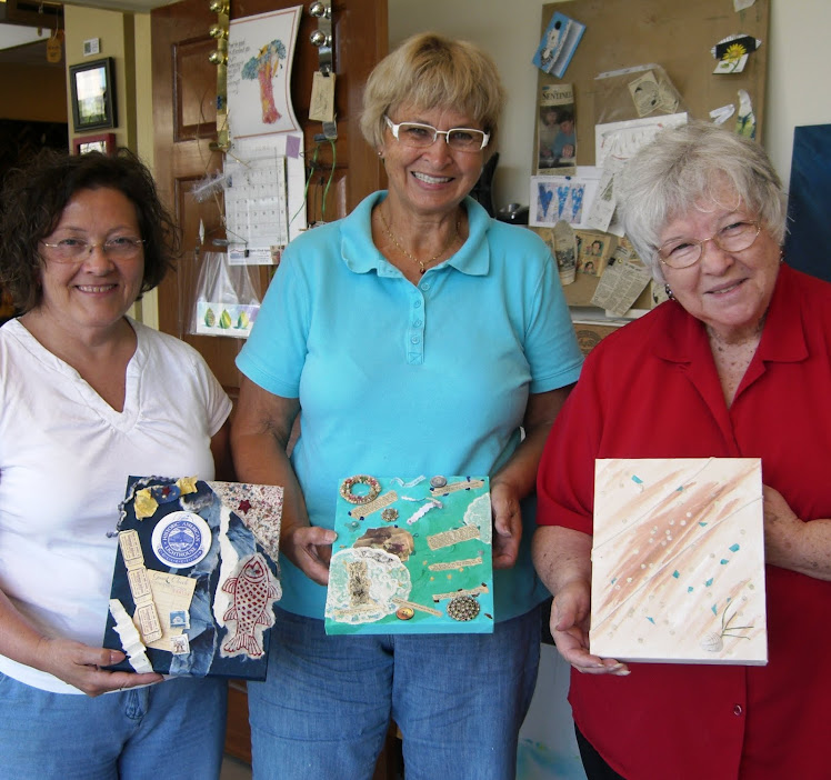
Fun and projects!
Mixed Media Class

Muriel
Mixed Media Class

Peggy
Mixed Media Class
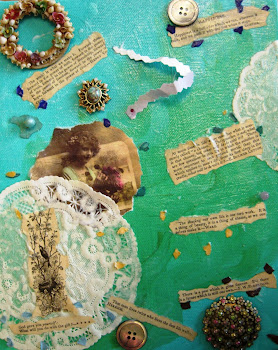
Nancy
Poppies ....

ready for their new home!
Ta Da .....
this little gem is ready for blog preview and Etsy post tomorrow!
Ta - da!!!!

I can now walk away from the Easter Pear!!!
Easter Pear?

I like pears better than eggs!!!
Easter Pear Step 1

Step 1 - I thought this would be enough ... silly me!
Easter Pear Step 2

Step 2 - I wanted to add a bit of EGG Whimsy.
Easter Pear Step 3

Step 3 - It wouldn't be mine if there weren't any cast shadows.
Easter Pear Step 4

Step 4 - And I love a good implied table line ... don't you??
Easter Pear Step 5
Step 5 - Oh, better kick up the value a bit!
Easter Pear Step 6

Step 6 - The background could use a value shift.
Easter Pear Step 7

Step 7 - Add, of course we need a bit of implied texture!
No comments:
Post a Comment